

By Michele Ronsen, Founder and CEO, Curiosity Tank, San Francisco, California, michele@curiositytank.com
Note-taking is a passion of mine. You might say, what!? It’s because I’ve really enjoyed developing approaches to note-taking that take me far into the analysis of rich but potentially unwieldy qualitative data—UX or otherwise.
More notes, and more data, aren’t necessarily better. In fact, gathering extraneous data can cause a lot of rework because you have to extract the information that does not tie directly to your study’s goals.
Analysis is an integral part of the qualitative research process. It can feel big and overwhelming, whether you are new to the process, haven’t planned a clear strategy before collecting data, or are a seasoned practitioner. Throughout my career, I have developed ways to take “notes” strategically, in live and retrospective note-taking, to right-size the amount of data collected, as well as expedite analysis without a lot of stress.
 The magic is assigning your qualitative and UX data into frameworks. Numerous frameworks can be leveraged, and I will introduce you to three in this article. These approaches can give you more accurate, efficient, and powerful research for your clients and help dial down the stress of translating bulky qual data into findings and insights.
But before I take you through the steps of leveling up your note-taking skills, let’s (re-)visit the pitfalls of more traditional note-taking approaches.
Typical Live Note-taking
You might be comfortable with the typical note-taking process, even if it’s not the most efficient. These skills tend to be based on writing down as much information as possible verbatim, as fast as you can, and in chronological order. However, this approach can lead to several issues, including:
- Lack of Understanding and Retention of the Material
Because the notes are all captured in real time, they are likely to be rendered in equal importance, and not organized in a way that is easily understandable or memorable. As a result, you’re likely missing out on the core information you really need. At a minimum, it will take longer to find and extract the essential information. If you don’t have a plan to organize your notes, you might miss out on something key that could help you uncover the most important or interesting information.
- Difficulty Keeping Up with the Conversation
Additionally, taking notes by hand during an interview or other type of research session may not be the best approach because it can be difficult to keep up with and focus on the conversation and may result in you missing vital information (such as important nonverbal cues). In haste, you can sometimes lose track of a key aspect without even realizing it.
- Lack of a Digital Record
Have you ever lost your physical session notes? Enough said. Lose them once and you’ll never hesitate to digitize them in the future. Digitizing your notes allows for safekeeping, better and easier manipulation and organization, and leads to more efficient analysis and synthesis. Relying on yourself and a piece of paper (or papers) can lead to many issues. Trust me!
Three Approaches to Note-taking
Let’s take a look at some more efficient note-taking alternatives that I’ve utilized in my own UX research. These have evolved quite a bit in the Ask Like A Pro series over the years.
Empathy Mapping (aka Think, Feel, Say, Do)
What is empathy mapping (TFSD)? Empathy mapping (www.curiositytank.com/ux-lexicon-blog/empathy-mapping) is a technique used to understand the needs, wants, and emotions of a specific group of people, typically customers or prospects. It is a visualization method that helps to create a deeper understanding of the people for whom a product or service is being designed, or anyone else we seek to better understand.
The Think, Feel, Say, Do framework or model—often referred to as TFSD—is one form of empathy mapping. With this method, we observe and listen to how a participant responds to a question or topic by evaluating multiple dimensions of the people we seek to understand.
How to Use Empathy Mapping (TFSD) with or without Transcription
This is one of my favorite note-taking frameworks because it switches up how we think note-taking should go.
To begin, think about a list of open-ended questions that will elicit various responses from your participants. When you conduct your sessions, your questions should include a focus not only on what your participants “say” but also on what they “think, feel, and do.” To optimize this approach, I author my discussion guides or activities to elicit responses to these specific questions. In other words, I choose my framework before authoring my discussion guides. A MadLibs, or sentence completion approach, also works wonderfully!
Here is an example of how these questions may align with the TFSD framework; however, it’s unlikely you will be asking the questions in this sequence, nor are these the actual questions that will be posed.
THINK:
- What are their goals and aspirations?
- What are their biggest challenges?
- What motivates them?
- What are their priorities and values?
FEEL:
- What emotions do they experience?
- What are their fears and concerns?
- What are their hopes and dreams?
- What gives them joy and satisfaction?
SAY:
- What are their communication preferences?
- What words and phrases do they use?
- What are their pain points?
- What do they say to others about their experiences?
DO:
- What actions do they take?
- What are their daily routines and habits?
- What are their purchasing behaviors?
- What are their decision-making processes?
This reverse-engineering approach requires you to author your discussion guide based on your desired outcomes or goals. I love this note-taking tactic because it forces you to capture a more holistic and comprehensive perspective.
To do this, physically split your notes into four quadrants or categories. From there, you categorize reactions, thoughts, and ideas into the four categories: think, feel, say, do. The map should provide a clear understanding of the individual’s needs and wants—or the target audience’s aggregated perspectives and behaviors—as well as possible pain points, opportunities, motivations, etc.
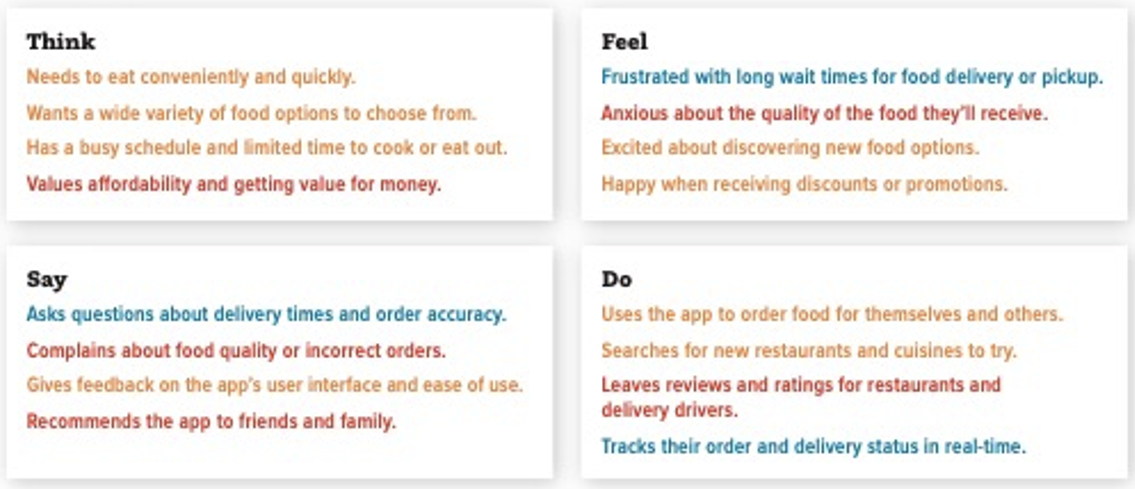
Example of Empathy Mapping (TFSD)
Imagine you’re working with a company to update their mobile food delivery app. Your aggregated TFSD empathy map may look a little like Example A. You might be asking, what’s the difference between “think” and “say” or “feel?” To me, in empathy mapping, “think” refers to the participant’s internal thoughts and feelings. These are cognitive or rational aspects of the person’s experience, such as their beliefs, thoughts, and attitudes. This includes things like what they believe, what they know, and what they think about their experiences.
“Say” refers to their external expressions, such as what they communicate verbally or nonverbally. “Feel” refers to the emotional or affective aspects of their experience, such as their feelings, emotions, and mood, including things like emotions experienced, the intensity of these emotions, and how those emotions are affecting their behavior.
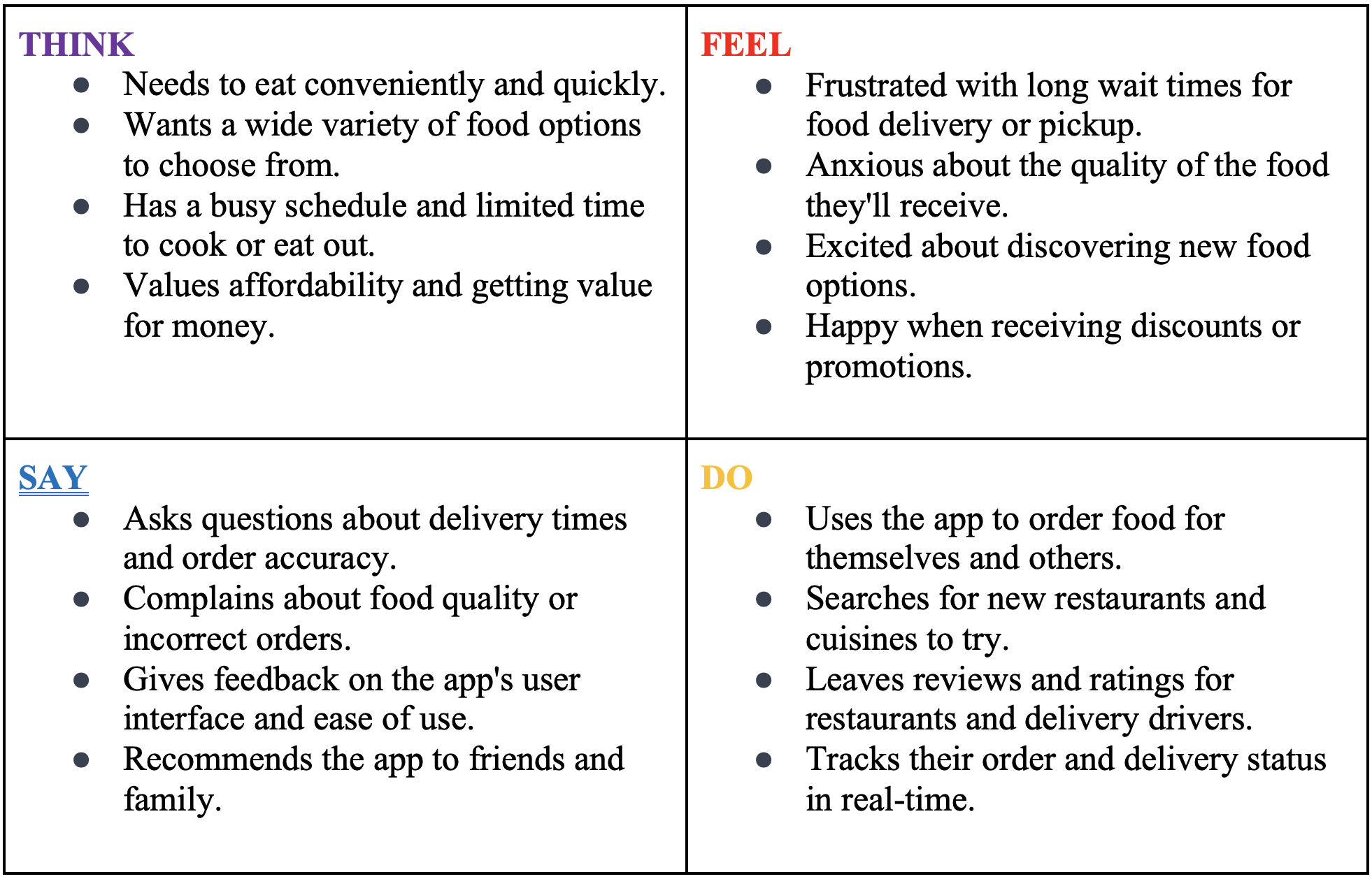
This sample TFSD empathy map leverages the data acquired from multiple participants. Now you and the organization for which you’re conducting the research can have a much better idea of how the aggregated targets think about the experience and the app. They are in a better place to improve the design based on a clear understanding of the attitudes and behaviors, as well as their context.
“Opposites” and “Spectrum” Frameworks
What Are “Opposites” and “Spectrum” Frameworks?
The “opposites” and “spectrum” note-taking frameworks are powerful tools for organizing and analyzing research data.
The “opposites” framework allows you to categorize the data into two opposing viewpoints and look for contrasts. The “spectrums” framework directs you to plot your data along a range or progression. These frameworks often require transcripts to start from, so I recommend transcribing your recordings. There are plenty of online services that transcribe recordings quickly and easily. Reduct.Video is my favorite, though, because it does so much more than transcribe.
How to Use the “Opposites” Framework
First, you’ll need to decide on the “opposites” you want to account for. You might use oppositions that are typically important in research, such as:
- “New Issues versus Recurring Issues”
- “Conditional versus Unconditional”
- “Emotional versus Tactical”
Or you might choose opposites that respondents create and name—that naturally occur to them at the moment. (Think of this in a similar way to an open card sort where participants name their categories.)
After you select the opposites, simply divide your workspace or document in half, then plot relevant notes on the relevant side.
Example of “Opposites” Framework
Let’s say you are working with Keurig and designing a home coffee maker and want to organize your notes on customer needs. One way to use the “opposites” framework is to divide your notes into two categories: “functionality” and “aesthetics.” Your notes could look something like this:
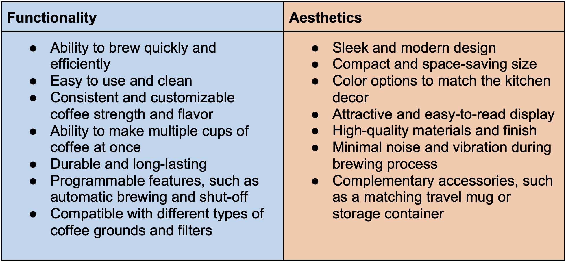
By separating the notes into these two categories, you can easily see the contrast between what the customer values in terms of functionality versus aesthetics. You can use this information to inform design decisions and priorities.
How to Use the “Spectrum” Framework
Here, you create or identify categories that create differentiation between the two end-points. These end-points may still act as opposing poles, but the in-between categories also demonstrate respondents do not necessarily have a polar perspective. Many times, they fall “somewhere in the middle.”
For instance, you might have a spectrum with the following categories:
- Effort Spectrum: Low effort, medium effort, high effort
- Attitude spectrum: plot attitudes toward a particular product or brand, ranging from extremely negative to extremely positive.
- Pain spectrum: chart the severity of pain experienced by individuals, ranging from no pain to excruciating pain.
- Trust spectrum: map the level of trust people have in a particular company or institution, ranging from complete mistrust to complete trust.
- Learning style spectrum: graph the preferred learning style of individuals, ranging from visual to auditory to kinesthetic.
- Emotion spectrum: display the intensity of emotions experienced by individuals, ranging from calm to extremely emotional.
- Risk spectrum: depict the level of risk associated with a particular decision or action, ranging from low risk to high risk.
- Innovation spectrum: illustrate the level of innovation in a particular industry, ranging from traditional to innovative.
These are just a few examples of the many different types of spectrums that can be used to capture and plot various data. The key is to choose a spectrum that is relevant to the particular context and data collected for analysis.
For a “spectrum” framework, add additional interim sections to represent the scale, gradient, continuum, or range of inputs along the progression.
Here’s an example of interim points on a learning style spectrum:
- At the midpoint of the visual-to-auditory range, an individual might have a preference for both visual and auditory learning styles and may benefit from a mix of visual aids and verbal explanations.
- At the midpoint of the auditory-to-kinesthetic range, someone might prefer both auditory and kinesthetic learning styles and may benefit from lectures accompanied by hands-on activities.
- At the midpoint of the visual-to-kinesthetic range, an individual prefers both visual and kinesthetic learning styles and may benefit from visual aids and hands-on practice.
- At the midpoint of all three ranges, someone might have a preference for a combination of all three learning styles and may benefit from a variety of learning experiences that engage their visual, auditory, and kinesthetic senses.
If there is no obvious interim section, you can add your own generic interim section called “midterm considerations,” “neutral,” or “indifferent” to create your spectrum or continuum.
For additional inspiration, you can also look to Likert scales. Our Likert scales tool (www.curiositytank.com/ux-lexicon-blog/likert-scale) is one of my favorites! It may be beneficial to frame your notes in terms of frequency, availability, satisfaction, likelihood, etc. Here is a frequency spectrum example.
- Never
- Rarely, less than 10 percent of the time
- Occasionally, about 30 percent of the time
- Sometimes, about 50 percent of the time
- Frequently, about 70 percent of the time
- Usually, about 90 percent of the time
- Every time
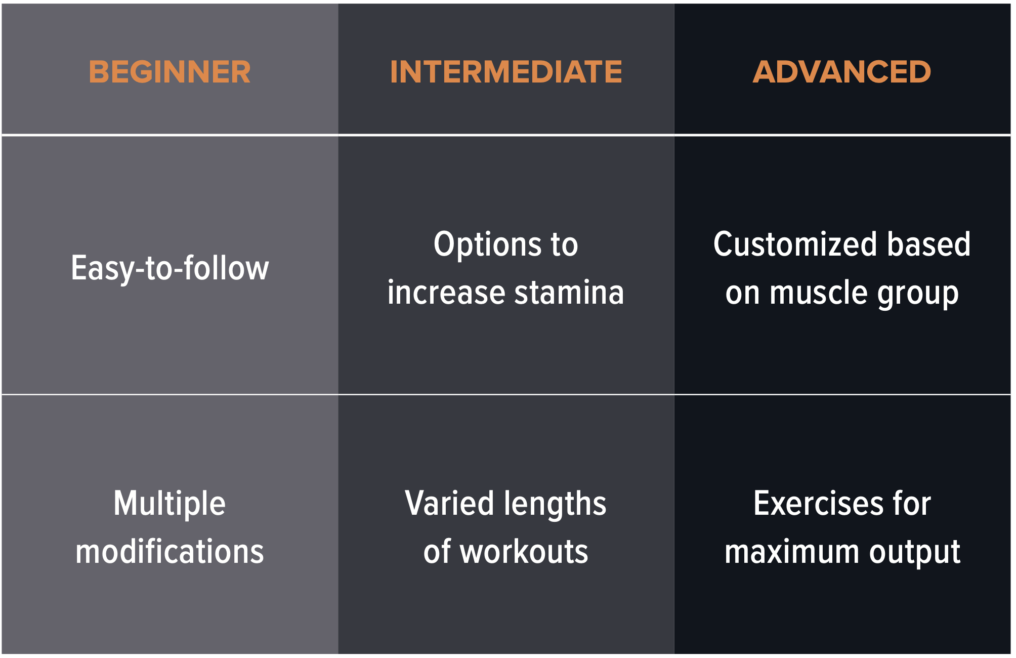
Now let’s work through a “spectrum” framework. For example, suppose you are helping a local gym create a mobile app. They want to make the app accessible to several groups of gym-goers. You could divide your notes into three categories according to their fitness levels: “beginner,” “intermediate,” and “advanced.”
By using three categories, you can easily see the progression of how participants’ fitness level corresponds to their needs. If it’s for UX research, you can leverage this information directly to help inform the content and design of the user experience, based on their various levels of fitness. This type of information would also be very helpful to inform a journey map! (www.curiositytank.com/ux-lexicon-blog/journey-mapping)
Color Coding
What Is Color Coding?
Color coding is the process of organizing or highlighting your notes by color to create a visual representation of different categories. While not a stand-alone note-taking technique, color coding can be an extremely helpful addition to any note-taking methodology.
By assigning different colors to different types of information, researchers and other stakeholders can quickly identify and locate specific passages without having to sift through pages of text.
How to Use Color Coding
Getting started with color coding is easy. Consider these steps as you begin your process:
- Choose a Color Scheme:
- Select a few colors to represent different types of information. For example, choose red to represent needs, blue for design-specific content, and green for functional or technical considerations.
- You can also use different colors of text to represent different levels of information. For example, you could use yellow to represent feedback, purple to represent action items, and orange to represent key quotes or follow-up items.
- This will allow you to easily “spot” different categories and types of information (by color) rather than “reading” each passage individually, again and again. This approach allows you to read and color code once, then organize at a glance.
- Categorize Your Notes: As you take notes—or after the fact—apply the selected colors to categorize the data in each spreadsheet cell or as a highlight.
- Use Color Coding Consistently: To make the most of color coding, be sure to use the same colors consistently throughout your notes across all participants in a study. This will help you quickly identify and find specific information when you need it.
Example of Color Coding
Suppose we were using the TFSD empathy mapping framework to conduct research. After organizing your notes, you could color code them like so:
- ORANGE: For features or aspects that are working well and should be maintained or improved upon (e.g., the onboarding process).
- BLUE: For areas that require attention or improvement but are not necessarily problematic (e.g., the assembly process).
- RED: For major issues or areas of concern that require immediate attention and fixing (e.g., the return process).
In Example B below, we’ve built on the TFSD empathy map from above and added sample color codes based on what could be the company’s current status and own perceptions with these aspects of the app.
EXAMPLE B
Here, the color coding provides further visual representation for the empathy map. Members of your team would be in a better position to take faster action from these notes compared to traditional notes or a black-and-white empathy map.
Final Thoughts
These note-taking techniques can help you organize more strategic notes, improve your analysis and synthesis efficiency and effectiveness, and move your stakeholders into action, faster. If you want to take your note-taking skills a step further, I also suggest paying close attention to what you choose to take notes on, and what you don’t, as well as how you take notes.
As I said earlier, more notes, and more data, aren’t necessarily better. In fact, gathering extraneous data can cause a lot of rework because you have to later remove the information that does not tie directly to your study’s goals.
Shoring up your note-taking tactics will help you work smarter, not harder. Utilizing techniques like these will help you take better notes, conduct more useful research, and have more overall success. Stay curious!

Do You Want to Dive Deeper on This Topic?
You may be interested in an on-demand version of the note-taking webinar by Michele Ronsen, which can be found in the QRCA Qualology Learning Hub.
Program: Qcast—Working Smarter: Note-Taking Strategies to Boost Efficiency