


By Renee Hopkins
Senior Qualitative Analyst
Numerator
Chicago, Illinois
renee.hopkins@numerator.com
As qualitative researchers, we are intimate with unstructured data: interview and focus group transcripts, photos, and videos. These are the artifacts of the human stories we collect, code, and analyze to uncover insights that answer our clients’ business questions.
Some of us falter in communicating those insights effectively. Unstructured data does not lend itself to easy communication.

Slide after slide of text insights and verbatims, even if they present brilliant insights, can be opaque and difficult to comprehend, regardless of how well-written.
While qualitative researchers could get away with that in the past, we are now up against a current trend: an increased interest in and reliance on visual communication in business.
In The Visual Economy Report, a 2024 study touting “the rise of the visual economy,” 93 percent of business leaders said that visual communication enhances idea articulation, and 89 percent said that communicating visually has helped them articulate critical points.1
While the study was perhaps not surprisingly sponsored by a graphic design company, Canva, it was based on responses from more than the 3,000 global business leaders surveyed on their view of visual communication in the workplace.
 Yet visual communication is way outside the comfort zone of many qualitative researchers. To help understand this trend and to shed light on how researchers can navigate it, I talked with Karen Middleton, K Middleton Design Studios, LLC.
Middleton is a qualitative researcher who is also a practicing studio artist and trained graphic designer. She combines her knowledge of qualitative research with visual design to transform complex behavioral information into visually compelling narratives that drive strategic decision-making.
Fortunately for us, she is also passionate about helping her fellow researchers learn how to use and apply visual communication techniques to elevate their qualitative data in ways that inspire action. I talked with her to discover her philosophy about visual communication for qualitative research.
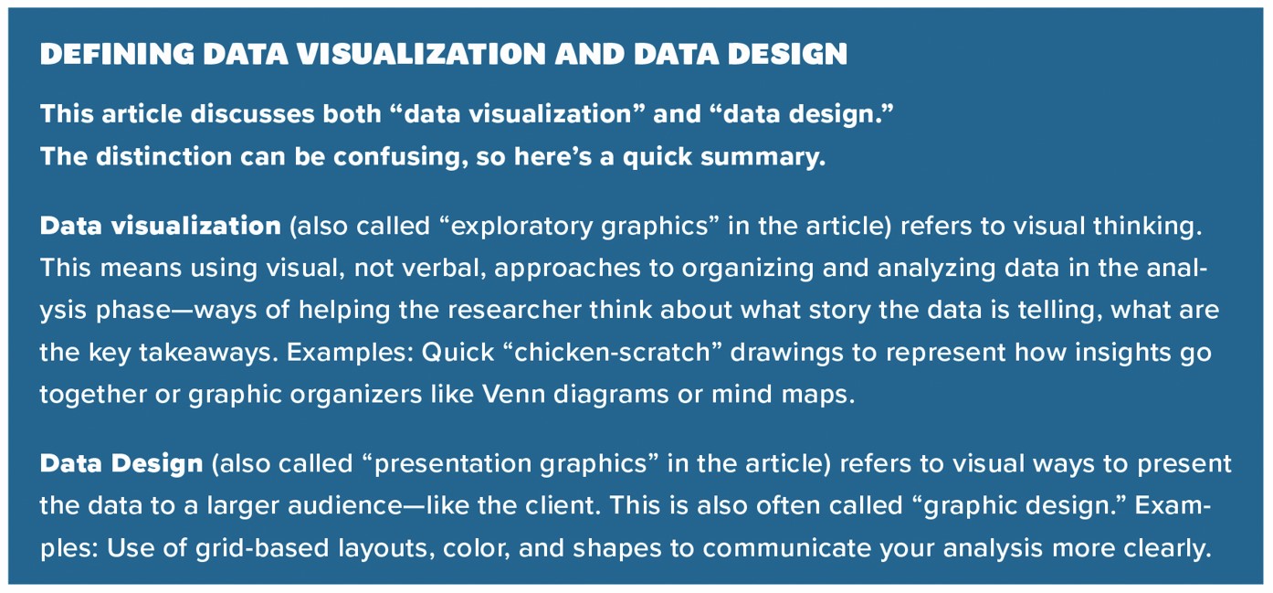
The Vocabulary of Visual Communication
First, to understand Middleton’s thoughts on this subject, I needed to learn her vocabulary.
Vocabulary paints a picture of how we think about a subject. This, too, should be familiar to qualitative researchers, who listen closely to the words participants use about products, brands, and more.
 In discussing the vocabulary she uses to frame her thinking about visual communication, Middleton cites a Harvard Data Science Review article by Anthony Unwin that discusses “exploratory graphics” versus “presentation graphics.”
“Exploratory graphics are used to find new information and should direct attention to information,” Unwin writes, while “presentation graphics are used to convey known information and are often designed to attract attention.”
“To me, exploratory graphics is data visualization,” says Middleton, “because it’s figuring out what’s going on in the data. What is it telling me? Then, presentation graphics is data design. Now, I say, okay, here’s what the visualization is, what the data is telling me. How do I translate that to somebody who does not know this data and may not be data-literate?”
Visualizing the Data: Figuring Out What It’s Saying
Middleton says data visualization—“exploratory graphics”—is a tool for analysis. “I tend to think of [data visualization] as more for the researcher, the analyst. They might say, ‘I have all this information, but I don’t know what is going on with it. I need to visualize it.’”
This process of visualizing data is also called visual thinking. Visual thinking strategies are increasingly taught in schools to

boost students’ critical thinking and ability to create evidence-based arguments. They may also go by the name “graphic organizers,” which refers to visual ways to organize written information. In education, graphic organizers help students visualize and construct ideas, organize and sequence information, plan what to write, brainstorm, organize problems and solutions, compare and contrast ideas, show cause and effect, and more. Venn diagrams, flow charts, and mind maps are all considered graphic organizers. Even color-coding can be thought of as a graphic organizer.
In business, in fields like project management and business planning, graphic organizers facilitate the organization and visualization of information, allowing for clearer understanding and communication, according to web-based platforms such as Miro. These platforms provide digital “whiteboards” that make it easy to use what Miro calls “conceptual framework organizers” that help us spatially group data or notes, and thereby break down complex concepts into simpler elements and understand the relationship between these elements.
I once worked for a manager who wanted his team to start the analysis process by identifying the main takeaway—and he wanted to see it visually. We could draw a picture or create an image out of PowerPoint shapes; anything to visually represent the relationships in the data that supported the top takeaway.
The goal was not to create pretty art, but to approach the data visually as part of the analysis. I still do it. Being challenged to draw the main takeaway instead of describing it in words allows me to conceptualize key points better than if I had used words to describe it.
Middleton says this kind of visual approach to the data analysis process is “awesome, because your brain interprets things differently when you work visually. You think about that information in a different way than if you’re just reading words or the notes that you took.”
She remembers being in the back room watching and listening as her partner conducted focus groups or IDIs. “I’d start to see ideas and I would draw them as I was taking notes. The more I heard, the more the visual would start to build and become more expansive.”
When you do that, she says, “you’re literally doing a data visualization right then. Eventually, that back-room visual will wind up in the report.” When I tell her I sometimes put my initial visual in reports as well, she laughs, “You just have to make it look a little bit nicer, maybe a little less like chicken scratches, before you put it into the report.”
It’s also worthwhile to take a visual approach after your initial analysis. “When you start to visualize written data, you see things that maybe you missed in your initial analysis. Or you’re making connections in a different way because your brain registers written and visual content differently.”
Designing the Data: Figuring Out How to Present It
Middleton says that thinking visually and thinking in terms of design—while overlapping, similar skill sets—are distinct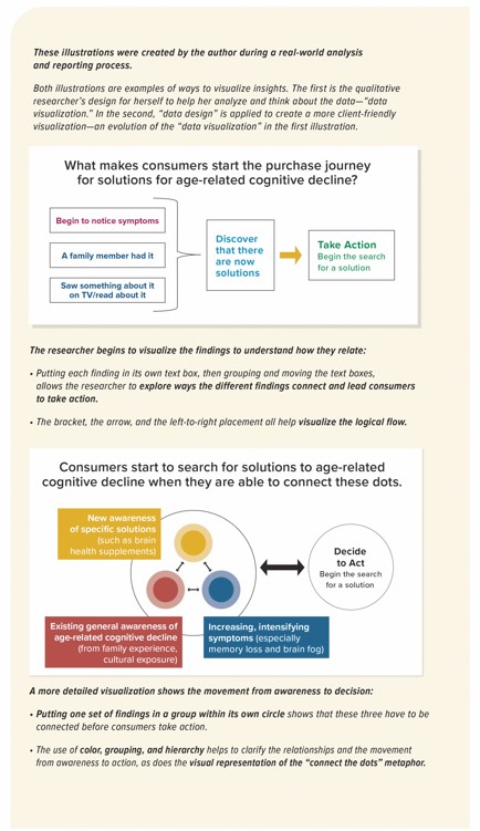 processes. “Between the two, you’re changing your thought process and how you’re thinking about the data.”
No matter how much value we get out of visualizing the data to better understand it ourselves, Middleton says we must remember that our goal is to communicate with our audience. “It’s great for you, the researcher, to visualize those key themes that are popping out. But not all data visualizations are helpful for your client or end-user.”
She admits: “I loathe word clouds with every fiber of my being. The decision-maker who’s high-level, who’s not data-literate, and who doesn’t know qualitative research is not going to understand a word cloud that shows you all these great themes. That’s like a quantitative researcher putting every single 20-column graph onto a PowerPoint slide as a report and saying, ‘Look, you understand it, right?’ The answer’s inevitably, always, going to be ‘No, what am I looking at? What’s important?’”
As the researcher, she says “You’re the expert in that information, and you understand it. But the CEO of your client’s company or whoever’s going to make decisions based on the data may not have the same level of data expertise you do, might not be as data-literate. So, you must design so that somebody who does not understand data will understand it and will be able to use that data to make a decision.”
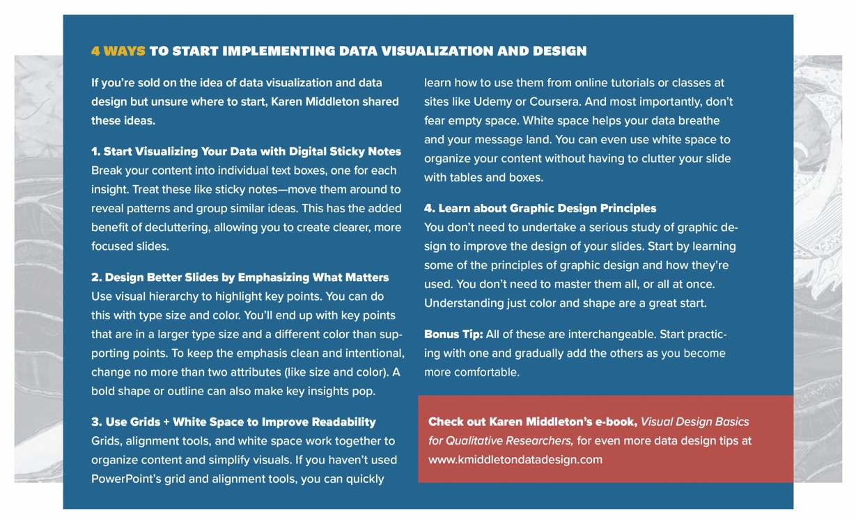
She advises us non-designers to remember that as we work with the data, we should be figuring out “ways you can take that text and turn it into an image. And I mean ‘image’ in a broad sense. It could be a graphic, it could be a photograph, it could be a chart, it could be using an icon as a key trigger for an idea that’s feeding through the data.”
However, the most important thing to remember is that “the data comes first. Design should not overwhelm your data. Good design is invisible, but data is not.”
To that end, she says, “I don’t start with a visual in my head. I start by reading through the information and then I say, ‘Okay, what am I working with? What am I seeing, and how do I translate that visually? The report writer put this content on this slide and then followed it up with this content on this other slide. So, these ideas are related. How can I combine them so one slide transitions seamlessly into the next slide?’”
Communication purpose is at the heart of her design decisions. “It’s my job as a designer to make this information stick, not to make it pretty. I’m designing it with a specific purpose in mind. I’m not going to put the latest and greatest sparkly creative stuff into it if that won’t serve my purpose. My purpose is to get the information across and make it memorable—and therefore actionable.”
When Middleton was starting to learn graphic design, “you could tell me the design principles all day. And I already knew color theory like the back of my hand. But how do you apply color theory and principles of design strategically, for a purpose? That takes time to learn.”
She says, “A lot of times people seem to think ‘I just need to design the data and everybody will understand it.’ But it’s a little different with qualitative because we don’t necessarily have as many built-in visualizations as quantitative can have. And that’s where graphic design comes into play. You need that skill set, need to understand the principles of design, you need to understand color theory.”
When working on a qualitative report, Middleton uses all the design tools at her disposal—colors, layout, images, charts, etc. Then, her qualitative research background allows her “to truly understand the qualitative data and how people interact with qualitative data.” She asks herself, “What is the intention that I’m trying to communicate? And how can I communicate it?”
She thinks of what she’s learned from eye-tracking studies. “I’ll think about how we interact with technology, how we interact with what we’re seeing. Then I can draw on my graphic design background, those design principles, the psychology of color.”
“I can use that to my advantage. I can put a grid on the slide and really force the eye to go where I want it to. And I know that people are more likely to remember the information and be able to use it when presented that way, versus a wall of text or a bunch of quotes and verbatims, or a bunch of bullet points.”
It’s not necessary for qualitative researchers to become experts at graphic design or user experience. An understanding of the basic principles of each is probably all we need to, as Middleton says, “get a little bit deeper than the surface level in terms of how to combine graphic design, qualitative analysis, and user experience. We’re not going to progress in our visuals unless we start to understand where all of that comes into play. And that’s the puzzle, I think, that we’re trying to figure out right now.”
REFERENCES
- The Visual Economy Report 2024. Canva. www.canva.com/design/DAGFXvrB7nY/71oYt1i9FMUGTcqbLA3Ehw/view
- Unwin, Anthony. Why Is Data Visualization Important? What Is Important in Data Visualization? Harvard Data Science Review, Jan 31, 2020
- Chaparro, Erin. Using Visual Thinking Strategies in the Classroom. Edutopia, June 2, 2022. www.edutopia.org/article/using-visual-thinking-strategies-classroom
- What is a Graphic Organizer? Learning Disabilities Association of America. https://ldaamerica.org/info/graphic-organizers
- Types of Graphic Organizers. Miro. https://miro.com/graphic-organizer/types
Check out Karen Middleton’s e-book, Visual Design Basics for Qualitative Researchers, for even more data design tips at www.kmiddletondatadesign.com.


Be the first to comment